


Men on Maps
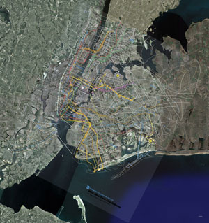 MTA vs. Google Earth 60" x 58" digital print
September 3 – October 10, 2008
Haven Arts Gallery, Bronx NY [map]
Opening Reception Friday Sept. 5, 5–9pm
"An exhibition of the unique aesthetic responses of over 40 male artists when presented with the Metropolitan Transportation Authority’s map of the New York Cities subway system as a base upon which to create. The blank canvas is gone, replaced by a loaded image for each artist to interpret and transform."
MTA vs. Google Earth
 MTA vs. Google Earth (detail) 60" x 58" digital print
My piece puts the New York subway map over satellite images from Google Earth which show the locations of MTA and other rail stations.
The New York subway map doesn't fit the satellite view because it has been intentionally distorted to make it easier to use. This practice evolved gradually over the history of such maps. The breakthrough was the map of the London Underground by Harry Beck in 1931. A collection of London tube maps can be fround here.
The satellite view isn't the "true" one. The Google map is also a distortion because it compresses a section of a sphere into a 2-dimensional rectangle. Both maps fill different functions by creating different fictions. In the work you can see how the stories relate to each other.